Outdoor Arts Italia changes its face, but not its mission, giving strength to the new course that began some years ago. With the new logo and new visual identity, the association marks, however, another important step in its growth journey, committing to better tell the story of the ongoing revolution and what its role is today among national and international references for performing arts in public space.
Not just that. We have looked at and compared ourselves with our European "peers". We have reflected on our role. We have exchanged good practices. We have developed different strategies for different contexts. We have, finally, felt the urgency to mark more precisely the distinction, albeit in complementarity, between the original nature of what is today the National Focus on Street Arts and the more articulated development project also embodied by the association's new name.
Reading keys of a sign
In the objective of finding synthesis between tradition and contemporaneity, between spaces and relationships, between trace and undertone, we fed to the natural intelligence of Paola, our graphic designer, the mission of reinterpreting us. The dots connected by her pencil went through different challenges, which are then the keys we share. The concentrated meaning from which Paola started was:
"The transformation responds to the need to represent with greater clarity and contemporaneity the work carried out and the positioning in the national and international landscape of performing arts. The association supports and promotes street arts through training, promotion, international actions and sector development. It is a facilitator of connections and a reference point for artists, operators and festivals, uniting tradition and innovation. The new visual identity will have to express professionalism, openness and movement, reflecting the solidity of its history and the dynamism of an Italian hub projected towards the future."
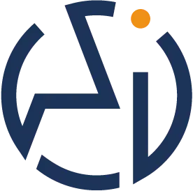
OAI are the initials of the name and it is from this abundance of vowels that the search for the stroke began. Vowels that seek each other, touch each other, complete each other, merge, but also escape and dodge opening possibilities. Vowels that draw without making themselves recognized, because you have to search for them and find them, to then always be there. Vowels for a monogram in balance on the path of the golden section.
For the pictogram we asked that it reflect the inspiration of Kandinsky's "Point and line to plane": a tribute to essential forms that become universal language. The point is thus the originary element, which transforms and generates possibilities. It is the person – the citizen, the artist – whose walking line crosses the dynamic plane of a public space, gets lost, finds itself again, to exit and re-enter. It is the living essence of movement that animates squares and streets.
It is a sign that also tells of the non-homogeneity of public space, which is not only the circle of the square within which the circle of the public is drawn, but dynamic territory dense with unexpected events, that invites entry, leaving free to exit. A boundary drawn of thresholds that lead to encounter with others and with art, even when you least expect it.
And finally, but it is not an end, from the pictogram also seems to emerge a maternal figure that bends down, with protective wings that embrace the artist's fragility, but without constraining them. Outdoor Arts Italia thus reflects itself as the mentor, not the captain: it accompanies, protects, guides, supporting freedom to be and to make mistakes, aware that it is in experimentation that art finds its strength.
The color of the sign
The choice of blue underlines the institutional and public dimension of Outdoor Arts Italia: color of stability and trust, which recalls the association's role in advocacy for the sector, in dialogue with institutions and in building international networks.
In this dynamic "monotony" of public space, the artist thus emerges as a orange point of chromatic rupture: the unexpected sign that breaks habit and restores wonder. That living point in the logo represents this energy, capable of transforming the everyday into aesthetic and shared experience.
The new logo is this and much more. Not only an image, but a visual synthesis of our history, our values and our vision and an invitation to continue to live, inhabit and transform together public space through arts and performance.